
Robert Olnick Pavilion / Alberto Campo Baeza + Miguel Quismondo
Curated by Benjamin Zapico
Sep. 26, 2023
We want to create a very simple and sober building while being the most beautiful in the world. We understand that this new building should complete and complement the main building of MagaZZino. To achieve this, it is arranged perpendicular to the first, creating a unified space between them. The new extension is set back from the main complex at an appropriate distance to address functional issues.
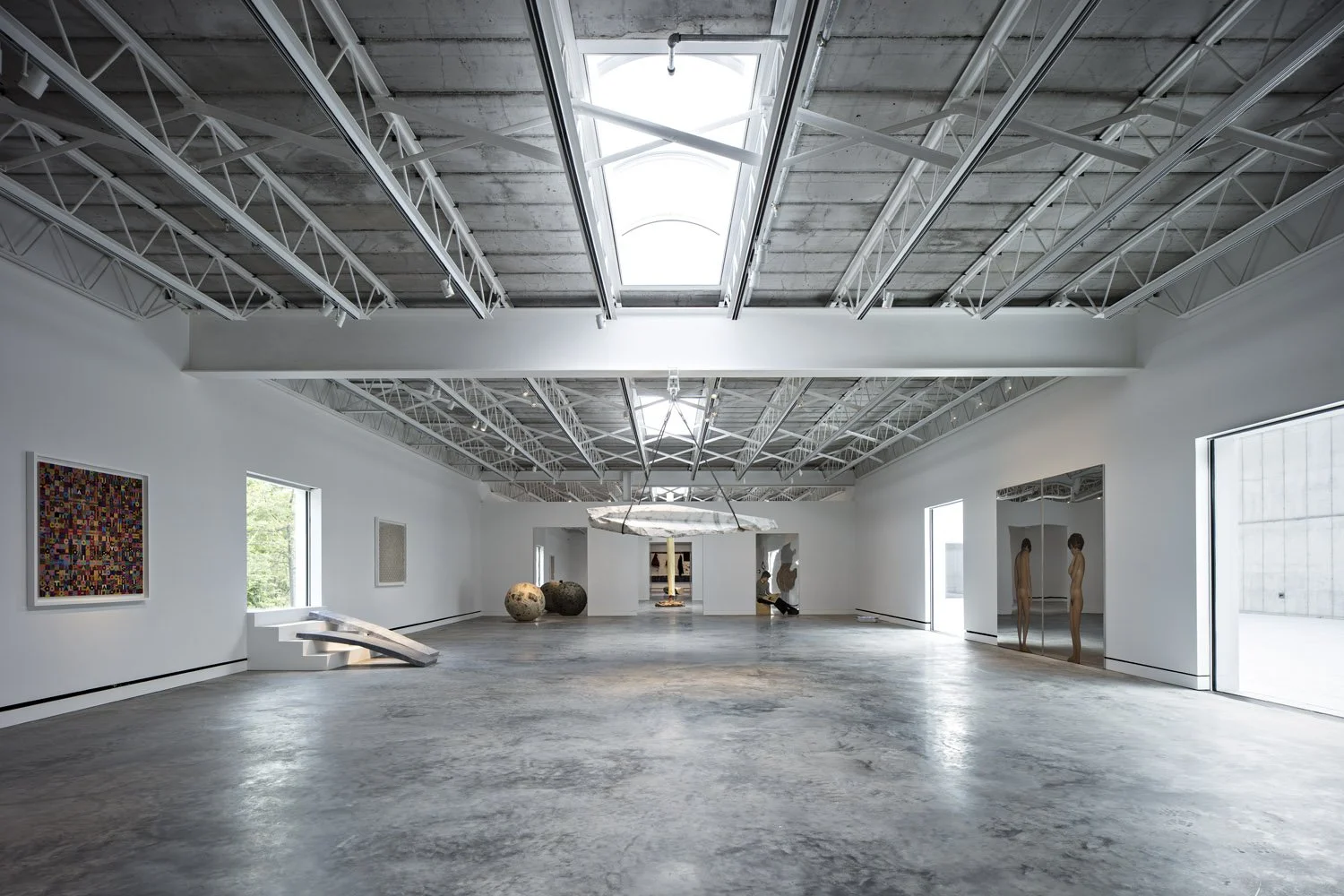
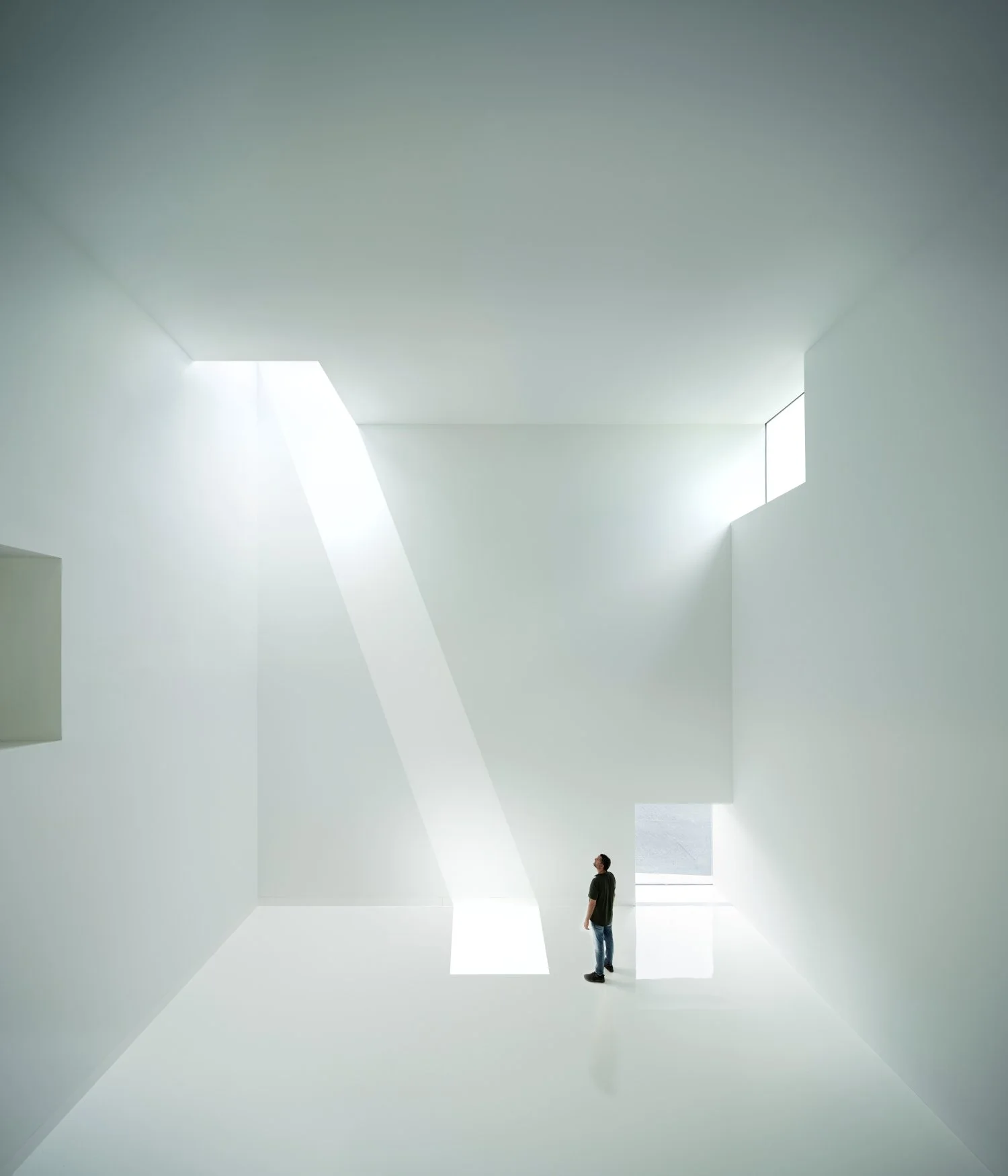
The height of the floor will be 11 meters, similar to the existing structures, as well as the height of the cornice. The agreement on the layout, measurements, and cornice line ensures a good relationship between the buildings. We believe that a central and important theme is the connection between the current and new buildings, resolved with an avenue designed as a common access plane that, when crossing the new building, allows for transparency on the ground floor as a background perspective that works spatially. This transparent space will be the lobby of the new building, which will also serve as a bar.
To the left of the entrance would be the room for Murano glass, double-height, with one or two translucent walls and a selection of glass pieces floating in the air, clearly showing their transparency. The Vignelli showcases can be on the walls of that room. It will be a very interesting space. Ceramics can be on the upper floor of the lobby bar.
To the right of the lobby is the temporary exhibition hall. As it is quite spacious, we believe it could be used as an auditorium with beautiful stackable chairs for conferences. The building can end there with an appropriate final courtyard. Or, if we consider it convenient, anticipating future uses, the walls can continue by being embedded in the ground and generating basements that can be further developed later on. The bathrooms, generously sized, will be located where the stairs are as if they were the kidneys of the building.
Outside, between the Museum and the new building, the Olnick Spanu Pavilion, is small, measuring 6x6x6 meters or 9x9x9 meters, connected through the main avenue. It will serve as a special space to receive each new work from MagaZZino before it is incorporated into it.
Under the Murano area, a semi-basement is created for possible classrooms, well-lit through a simple English patio. We believe that the solution is topographically suitable, and we understand that the influence of the existing wetland area can be mitigated with simple geotechnical means.
Photo credits: Javier Callejas, Marco Anelli, William Mulvihill
Pabellón Robert Olnick / Alberto Campo Baeza + Miguel Quismondo
Curated by Benjamin Zapico
Sep 26, 2023
Queremos hacer un edificio muy sencillo y sobrio y a la vez muy hermoso, el más hermoso del mundo. Entendemos que este nuevo edificio debe completar y complementar al edificio principal del MagaZZino. Para ello se dispone en barra perpendicular al primero, creando entre ambos un recinto unitario. La nueva ampliación se retira del conjunto principal la distancia adecuada para resolver temas funcionales.
La crujía será de 11 m, semejante a la de las construcciones existentes. Y lo mismo su altura de cornisa. El acuerdo de trazas y de medidas y de línea de cornisa garantiza la buena relación entre los edificios. Entendemos que un tema central, importante, es la unión entre el edificio actual y el nuevo, resuelta con una avenida planteada como un plano común de acceso que, al atravesar el edificio nuevo, permite una transparencia en planta baja como fondo de perspectiva que funciona muy bien espacialmente. Ese espacio transparente será el vestíbulo del nuevo edificio, que también acogerá las funciones de Bar.
A la izquierda del acceso estaría la sala para los vidrios de Murano, a doble altura, con una o dos paredes traslúcidas y la selección de piezas de vidrio flotando en el aire y mostrando a las claras su transparencia. Las vitrinas de Vignelli pueden estar en las paredes de esa sala. Será un espacio muy interesante. En la planta alta del vestíbulo-bar pueden estar las Ceramics.
A la derecha del vestíbulo, la Sala de Exposiciones temporales. Como es bien amplia, creemos que podría usarse cuando haya conferencias como auditorio con sillas, bonitas, apilables. El edificio puede terminar ahí con un adecuado patio final. O, si lo viéramos conveniente previendo futuros usos, pueden continuarse los muros empotrándose en el terreno y generando unos sótanos que pueden colonizarse más adelante. Los aseos, generosos, donde las escaleras, como si fueran riñones del edificio.
Y fuera, entre el Museo y el edificio nuevo, el Olnick Spanu Pavillion, pequeño, de 6x6x6 m o de 9x9x9 m, conectado a través de la avenida principal. Servirá de espacio especial para recibir cada nueva obra del MagaZZino, antes de incorporarse a él.
Bajo la zona de Murano se crea un semisótano para posibles aulas, bien iluminado a través de un sencillo patio inglés. Creemos que la solución es topográficamente adecuada, y entendemos que la influencia de la zona de humedal existente puede ser desplazada con sencillos medios geotécnicos.
Photo credits: Javier Callejas, Marco Anelli, William Mulvihill

1123 Walnut St / MQ Architecture
Curated by Paula Pintos
Apr 11, 2023
This commission encompassed two separate commissions. The first one was to develop a two-story mixed-use building on a 48 feet wide by 150 feet deep “party” lot. The second challenge consisted of the design of a new typology of hospitality: a cannabis lounge for the recreational consumption of Marihuana.
The project faces Boulder’s Downtown Historic District, a Landmark area built around 1880 where most of the lots are 25 feet wide with brick party walls. After World War II plenty of these buildings were modernized with metal and precast facade panels.
We identified the most characteristic formal elements of the 1880s: two brick party walls; an upper story with a prominent roof cornice and 4’x8’ vertically proportioned windows; ground floor with large storefront display windows, recessed entrances, display window bulkheads and exposed cast iron columns.
We abstracted these elements to design the facade, applying contemporary materials with a reference to the modular and prefabricated panel systems from the mid-century. Therefore, the upper level is solved with aluminum white crate panels mounted on brackets over a stucco finish, creating a pattern with large 4’x8’ operable windows and folding on the top creating the cornice; the ground floor with 12’ high glass panels, aluminum frames, aluminum cladding, and circular white steel columns. Since the street level required separate entrances for the three different uses, we proposed two symmetrical recessed entrances on both sides of the facade. The entrance to the hospitality is on the East end and the entrance to the office space is on the West side, with the retail storefront running in between.
As the marihuana hospitality required a space deprived of windows, we placed it on the back area of the ground floor. In order to bring natural light to the space, we conceived a large 16×16 feet skylight flooding the space with light through a gold aluminum crate that impedes direct visual contact between inside and outside. The skylight becomes an open patio with a terrace on the second floor that contributes to organizing the office space. In section, the skylight and the patio work together as an inverted terraced pyramid, bringing natural light uniformly throughout the deep floor plan. Some vegetation sits on the perimeter of the skylight.
The vestibule of the office space is crowned with a white perforated metal staircase suspended from the ceiling with backlit reclaimed wood treads recovered from the original building. The second floor, conceived as an office rental in its entirety, is an open plan with a service bar allocating bathrooms, a kitchenette, and vertical circulation. Through the long-windowed wall and the aluminum crate facade, the office takes advantage of the spectacular Iron flats views.
Photo credits: Imagen Subliminal (Miguel de Guzmán)
https://www.archdaily.com/999217/1123-walnut-st-mq-architecture

Stella's Cucina Restaurant / MQ Architecture
Curated by Paula Pintos
Feb 11, 2023
Originally conceived as a cannabis lounge, Stella’s Cucina sits in the core of a new commercial building facing Boulder’s Historic District. As the enterprise could not be seen from the exterior, the space does not establish relationships with the city; therefore, we envisioned the project as an inheritor of the Speakeasy underground scene of the American Prohibition era and we sought the opportunity to bring natural light through a central skylight. This idea of an old-fashioned, elegant, but concealed space, profoundly influenced the design of the project. Only an “S” indicates Stella’s entrance on Walnut Street, hidden behind a towering 12 feet aluminum door under a perforated metal canopy.
From entering the building to sitting at your table, Stella’s is an entirely new hospitality experience, one shrouded in elegance and mystery: as one opens the aluminum door, the space is compressed with a curved white ceiling. The existing brick wall on one side and its reflection along the opposite mirrored wall, escort guests to the interior. In the lobby, an oak wall with a check-in window awaits the visitors, where an unseen bouncer cards the guests. From there, a hidden wooden door reveals a dark corridor, where the host welcomes the visitors and walks them through a compressed and dimmed space with wood walls.
The low light adapts the eye and the slotted curved wall forces it to change direction and pushes the guest into the squared dining room with a massive 16’x16’ skylight centered in a navy blue background. The light is filtered through a golden aluminum egg crate. Below, a 45-degree rotated bar with curved corners welcomes and invites the guests onto the perimeter tables. This entrance view emphasizes the grid and allows the guest to have a glimpse of the whole dining room, while the back mirrored wall doubles the whole space, and a large screen wall serves as a digital window.
A curved fixed seating is arranged on the perimeter of the square. The flesh fabric of the millwork waves and flows reflecting the relaxing, inventive environment for guests to unwind and let the space envelop them. On the left and right walls, equidistant columns separate the main space from the white vaulted dining areas in the back, which allow for a more private affair. Capping off the space, the entry wall displays a long wood wall with a modular Marihuana leaf pattern.
Stella convenes the Speakeasy concept with contemporary Italian Cuisine proposing an Art Deco-influenced color palette. The elegant navy-blue background allows the flesh tones to create a warm atmosphere with sleek accent gold elements, on a nostalgic 1930s-era tone. The central skylight bathes the bar with light at all times and works as a solar dial. When the sun sets, the lights commence a sequence of settings that get darker as the DJ stage on the corner takes prominence while the Italo disco night starts.
Photo credits: Imagen Subliminal (Miguel de Guzmán)
https://www.archdaily.com/996110/stellas-cucina-restaurant-mq-architecture

Alberto Campo Baeza y Miguel Quismondo diseñan nueva ampliación para el Museo de Arte Magazzino
By Eric Bladwin | Translated by Piedad Rojas
Dec 01, 2020
El Museo de Arte Italiano Magazzino está ampliando su sede en Cold Spring, Nueva York, con un nuevo pabellón diseñado por los arquitectos españoles Alberto Campo Baeza y Miguel Quismondo.Tras la apertura del museo en 2017, el nuevo pabellón estará dedicado a exposiciones especiales y programas públicos y educativos. La estructura independiente contará con una programación flexible para permitir que el museo sin fines de lucro respalde su programa en crecimiento y sirva mejor a sus visitantes.
El Museo de Arte Magazzino se lanzó como un nuevo espacio de arte en el valle de Hudson dedicado al arte italiano contemporáneo y de posguerra. La última incorporación se produce después de la adquisición de 3,5 hectáreas de terreno adicional para el nuevo pabellón.
Alberto Campo Baeza y Miguel Quismondo diseñaron el edificio principal de Magazzino, cuya expansión creará más de 5.000 pies cuadrados de espacios flexibles de exhibición y programación, así como nuevas comodidades para los visitantes, que incluyen un salón de lectura y una cafetería.
El museo ha sido ejecutado con el compromiso de servir como un centro cultural y un recurso comunitario vibrante, y para brindar oportunidades de inspiración y compromiso con el arte y la creatividad, dice el italiano Vittorio Calabrese, director de arte de Magazzino:
“Nuestro programa se ha vuelto cada vez más ambicioso desde hace tres años y medio, a medida que la institución crece. El nuevo pabellón nos permitirá servir mejor a nuestra comunidad con recursos expandidos para los visitantes y nos brinda espacios flexibles para que podamos expandir nuestra oferta programática en Cold Spring”
El nuevo pabellón se ubicará junto al edificio principal y reflejará la estructura en su diseño rectilíneo, que contará con una serie tragaluces y cuya fachada será de concreto. La adición agregará casi 3.600 pies cuadrados de nuevo espacio, incluidas dos galerías llenas de luz en su nivel principal y una tercera galería en el piso inferior para la exhibición de Cristal de Murano y cerámica. El nivel inferior contará con espacio de programación adicional y un patio al aire libre hundido. En su último piso, habrá una cafetería y un salón de lectura con asientos en el interior y al aire libre.
Concebido para complementar el edificio del museo existente y reflejar su diseño moderno elegante y simple, el nuevo pabellón aporta una nueva dimensión en evolución, comenta el arquitecto del proyecto Miguel Quismondo:
“Con ventanas y tragaluces colocados estratégicamente, el edificio presenta nuevas oportunidades para que los visitantes disfruten de la belleza del campus, ya que agrega un espacio muy necesario para el creciente programa educativo y curatorial del museo, permitiendo la presentación de proyectos en nuevos formatos. Estoy encantado de trabajar con mi mentor Alberto Campo Baeza en el diseño de esta nueva estructura. Este proyecto refleja tanto el crecimiento de la institución como la creencia y el compromiso de Nancy y Giorgio con la comunidad de Cold Spring”
Se espera que la palada inicial comience en la primavera de 2021, con exposiciones y programas que continúen ininterrumpidamente en el edificio principal de Magazzino.
Photo credits: J.C Bragado & J.Mingorance (MQ Architecture)

Small Wooden Pavilion / MQ Architecture
Currated by Paula Pintos
Apr 24, 2019
This project entitled a surgical demolition of an existing shed and the erection of a small ancillary building. The old structure housed the electrical and communications utilities of a large compound, and the new project had to preserve the location and function of all this equipment, therefore some walls and floor levels are set from the beginning. The program required two different type of users, therefore we decided to split the building in two, allowing for a separate circulation for each group. The upper piece houses the electrical room and the team quarters, while the lower portion holds two individual restrooms for visitors.
The project sits in the middle of the forest therefore we chose charred wood to make it blend with the surrounding nature. On the other hand, the polycarbonate façade brings natural light and privacy to the interior. All floors are made of polished concrete for easy maintenance and a radiant slab keeps an optimal temperature during extreme wints.
A Little Great Pavilion. By Alberto Campo Baeza. Today, on a stroll in Midtown Manhattan with Miguel Quismondo, under an unusually radiant December sun, on 242 east 52nd Street, we discovered a wonderful, small building, between party walls. Only three floors with exposed brick and an exposed metal structure. A perfect example of control, beautiful, that could have very well been signed by Mies Van der Rohe himself.
When we googled it on Miguel’s phone, we discovered that it was from the prolific Philip Johnson. In truth, when Philip Johnson designed as a Master, he knew how to do it very well. In the same way, when Miguel Quismondo designs like the Masters, he knows how to do it more than well. He has just finished a small pavilion in Garrison for the Olnick Spanu family, right after finishing the magnificent Magazzino, the arte povera museum for the same clients.
This small pavilion is all built in wood. The occasion, the function, the size and, especially the location, required it. In order to protect the double shifted structure, he decides to cover it with a simple sloped galvanized metal roof. Everything is simple but exquisite. It brings to my mind references of Sea Ranch, Charles Moore’s best work and even some of the architecture of Glenn Murcutt. Every detail in the erection of this pavilion is a prodigy of good construction, of a deep knowledge of how we should built in wood. But first, and above all, we must emphasize the adequacy of the idea and the beauty of the result. A small great work of a true master.
Photo credits: Imagen Subliminal (Miguel de Guzmán)
https://www.archdaily.com/915720/small-wooden-pavilion-mq-architecture

Magazzino Italian Art / MQ Architecture
Currated by Danae Santibañez
Feb. 27, 2018
Magazzino Italian Art es una iniciativa privada concebida por Nancy Olnick y Giorgio Spanu para albergar su colección de arte italiano de posguerra. La comisión consistió en una renovación completa de un edificio existente de 11,000 pies cuadrados y una ampliación de 14,000 pies cuadrados. La estructura existente en forma de L se erigió en 1964 como un centro de distribución de productos lácteos y estaba rodeada de muelles de carga y cubiertas en voladizo. La ampliación necesitaba un espacio libre más alto (ya que algunas de las piezas de la colección son de gran tamaño) así como una luz natural muy controlada.
El concepto fue simple: el edificio existente en forma de L podría completarse en un rectángulo con un patio central. Esta idea nos permitió proponer una estructura independiente que corría paralela a la parte más larga del edificio existente y unir ambas estructuras por medio de dos conectores de vidrio, lo que enfatiza su ligereza. En consecuencia, se establece un diálogo entre el edificio nuevo y el existente; el edificio existente trabaja con la luz sólida específica proveniente de los tragaluces, mientras que el nuevo galpón propone una luz uniforme y tenue que aprovecha al máximo el conjunto. En ambos espacios, hemos intentado maximizar la flexibilidad de la luz artificial mediante rieles a lo largo de la cara inferior de las cerchas.
La estructura existente se abre al patio, mientras que la adición solo abre una vista panorámica a los Humedales. Además, la yuxtaposición de los dos volúmenes hace que el patio central se convierta en una sala virtual, una extensión del vestíbulo, mientras que una lámina de agua regulariza su geometría y facilita la transición entre el edificio existente y la ampliación. El flujo de circulación es un simple anillo que facilita una secuencia intuitiva de salas de exposición; para evitar que los visitantes se sientan abrumados por la explosión de arte, los espacios abiertos al exterior ayudan a descansar la vista durante todo el recorrido.
El tráfico constante en la Ruta estatal 9, que corre al lado de la pendiente donde se ubica el proyecto, nos obligó a cerrarnos a la carretera. Para mantener un ambiente interior lo más silencioso posible creamos una estructura de hormigón alejada del edificio para albergar las instalaciones; esta nueva estructura regularizó la llegada y los jardines circundantes, permitiendo a los visitantes descubrir la entrada por contraste de volúmenes y materiales
Magazzino, que significa almacén en italiano, intenta homenajear su nombre y la colección Arte Povera que alberga. Mientras los artistas trabajaron con elementos de baja calidad o de fácil acceso, queríamos seguir esta filosofía mediante el uso de componentes y técnicas de construcción sencillos. El muro de hormigón de encofrado "in situ", formado con paneles fenólicos, forma la piel del nuevo contenedor; la cubierta del techo se resuelve utilizando una estructura simple que involucra cerchas metálicas a dos aguas, y las paredes blancas interiores crean un fondo neutro para disfrutar del arte.
Photo credits: Javier Callejas
https://www.archdaily.cl/cl/889524/magazzino-italian-art-mq-architecture